


6 colour scheme ideas from Julia Kendell
Take a look at the six rooms we’ve created – each based on an inspiring photograph. You can see how each image translates into the finished room scheme and how fun and easy it is to put a successful room design together.
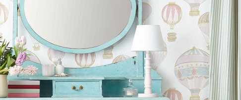
Pretty pastel bedroom
The photo inspiration is a scrumptious image of pastel macaroons. the fresh, feminine feel is perfect for a bedroom. The end result is a pretty room with well-balanced colour, good enough to eat!
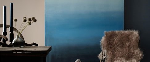
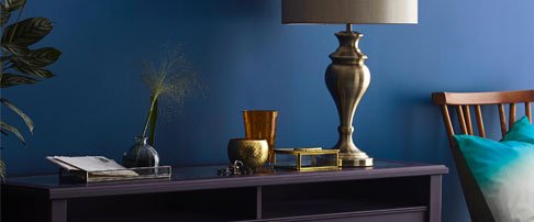
Stormy dining room
A brooding sky photo was our inspiration for producing this striking dining interior using shades of blue, mysterious tones of deepest blue-black and a warm peachy hue.
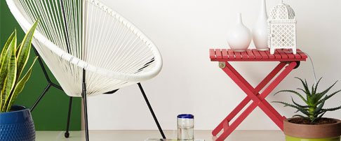
Mediterranean living room
Inspired by the Greek islands, this scheme works well in a naturally light living room. Use reflective surfaces, pops of colour and quality lighting to emulate the bright light of the Med.
Jewel toned hallway
The peacock-inspired jewelled tones of these thread spools create a vibrant mix of shades. translating this scheme produces a luxurious, elegant welcome, particularly successful in a naturally dark hallway.
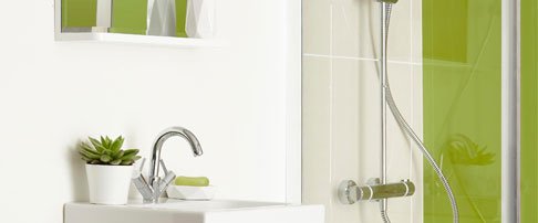
Minty fresh bathroom
This image shows how warm cream tones soften clinical whites and cool greys, creating a afresh, relaxed picture. A pop of colour in the mint leaves transforms the image, adding another colour dimension, perfect for a fresh bathroom scheme.
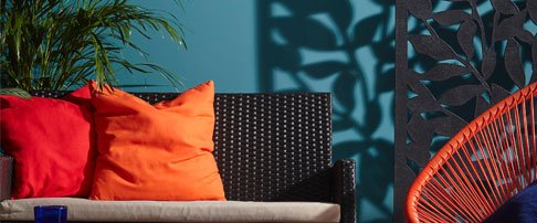
Tropical conservatory
This striking photograph illustrates just how successful contrasting colour combinations can be in nature. This bold scheme transforms a conservatory from bland and boring to a space you’ll want to spend time in.
How to create a colour scheme from an image you love
Putting a colour scheme together can be both exciting and terrifying! You can choose one favourite colour, but a successful interior combines many colours and it’s this combination, in the right proportions, that will determine whether the outcome has a good balance.
To help you successfully create an interior scheme, try this effective design method based on using a photograph for inspiration. Creating your design around your chosen colour palette, with the same distribution as your inspirational image, you can feel confident that your end result looks as stunning as the original photograph.

1. Find a photograph you love
So how do you do it? First choose a photograph you love, which conveys the feeling you’d like to express in the room. There are thousands of stock images online to look through, or something might catch your eye in a book or magazine. Better still, find a photo you’ve taken yourself that evokes personal, happy memories.

2. Match colours to your photograph
Carefully deconstruct the image and, using physical or online paint swatch cards, take time to match as many colours within the photo as closely as possible. Line up your swatch cards next to your image – this colour palette will form the basis of all the colours in your room and you can refer to it when you’re making decorating and furnishing decisions.
3. Put your room design together
Next, it’s important to work out how much of each colour is used in the image. Using these colour proportions in your room design, ensures the balance and feel remain the same as the image. Make sure that everything you choose for the room fits the palette to create exactly what you intended. Textures should emulate those in the original image. Create a mood board to cross-check the balance of colour, tonality and texture.

About Julia Kendell
With over 30 years’ experience as an interior designer Julia’s portfolio is packed with projects ranging from elegant yet practical homes all the way to large scale restaurants and hotels. You may recognise her from her regular appearances as the resident design expert on BBC1s DIY SOS or ITVs 60 Minute Makeover where she prides herself on creating fabulous interiors on tight budgets and limited timeframes. She also finds the time to impart her easy-to-follow advice to you through her videos and guides.


